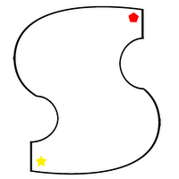
Map Layout
*Yellow star marks the starting point
*Red shape marks the end point
After consultation... we decided to use simple maps and implement the decreasing water level mechanism.

Map#1 -- the "S" shape is intentionally done fatter and with more gentle curves to prevent deep corners that players will end up in and be doomed for game over when the water level is too low.

Map#2 -- the map was among one of the first few designs when we first sat down to brainstorm on the map layouts. we chose this for it's "clean" look without too many bends and curves yet provides wide navigation area for us and the players to play with.

Map#3 -- just exploring the possibility of using this (replacing the circle shape) as one of the map in the games.
There's Map#4 but after uploading, it just shows a black box with the start and end points in the diagram... I would like to upload it but due to some technical problems out of my ability to rectify... It's the fat "C" shape... all these maps have been uploaded into our own ivle community.
Considering to: remove mini-map idea. Will have a screen introducing to players the mods in this level and the shape of that level's map will be in teh background of this screen. Given that we have chosen simple shapes as our map layout, it seems to provide players with too much positive feedback to even supply them with a mini-map.
Before consultation... we didn't implement the decreasing water level mechanism and so a maze within the map will provide sufficient challenge to the players. However, we were still considering if it'll be more interesting to implement the decreasing water level mechanism.

Map#2 -- in an attempt to simplify the complicated + ugly Map#1

Map#1 -- first ugly map produced.
aim: to be complicated so as to provide sufficient challenge to players

0 Comments:
Post a Comment
<< Home